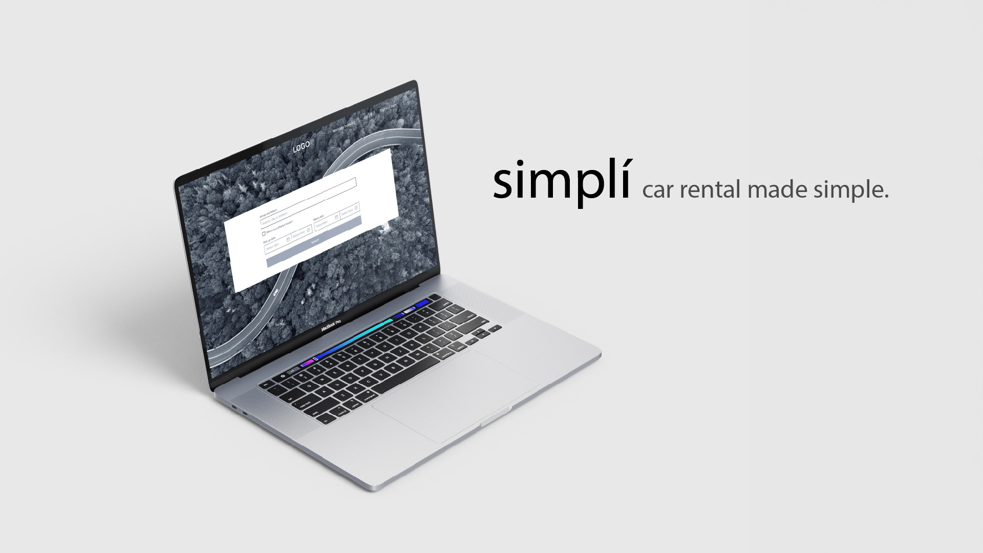
Project Overview
Brief
This case study was completed as part of the UX Design Institute diploma and the brief was pre-defined as:
Your client is a start-up car rental company. They’re looking to create an online experience that is fast, easy and intuitive: one that’s based on a deep understanding of their target users.
Design a new desktop website for your client, focusing specifically on the car rental booking process.
Your client is a start-up car rental company. They’re looking to create an online experience that is fast, easy and intuitive: one that’s based on a deep understanding of their target users.
Design a new desktop website for your client, focusing specifically on the car rental booking process.
Role
UX Designer User research, designing and prototyping.
Tools Figma and Miro
Duration November 2022 - April 2023

Design Process
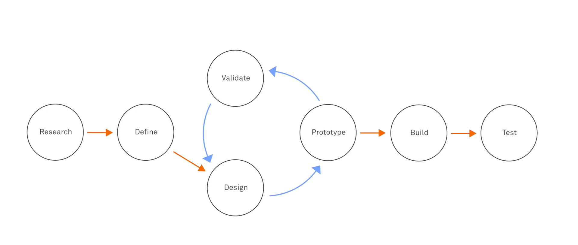

Context
For my case study, I chose car rental, because it's an area that can really benefit from UX. The decision is rooted in the acknowledgment that the online car rental process is inherently multifaceted, presenting both challenges and opportunities for enhancing the way users interact with digital platforms.
My intention is to delve into the intricacies of car rental services, dissecting their existing UX methodologies to discern what works effectively and pinpointing areas that should be approached with caution. By closely examining the booking processes employed by other car rental services, along with conducting research I aim to draw valuable insights that will serve as the foundation for refining and elevating the user experience in my own designs.

User interviews & Usability testing – Research
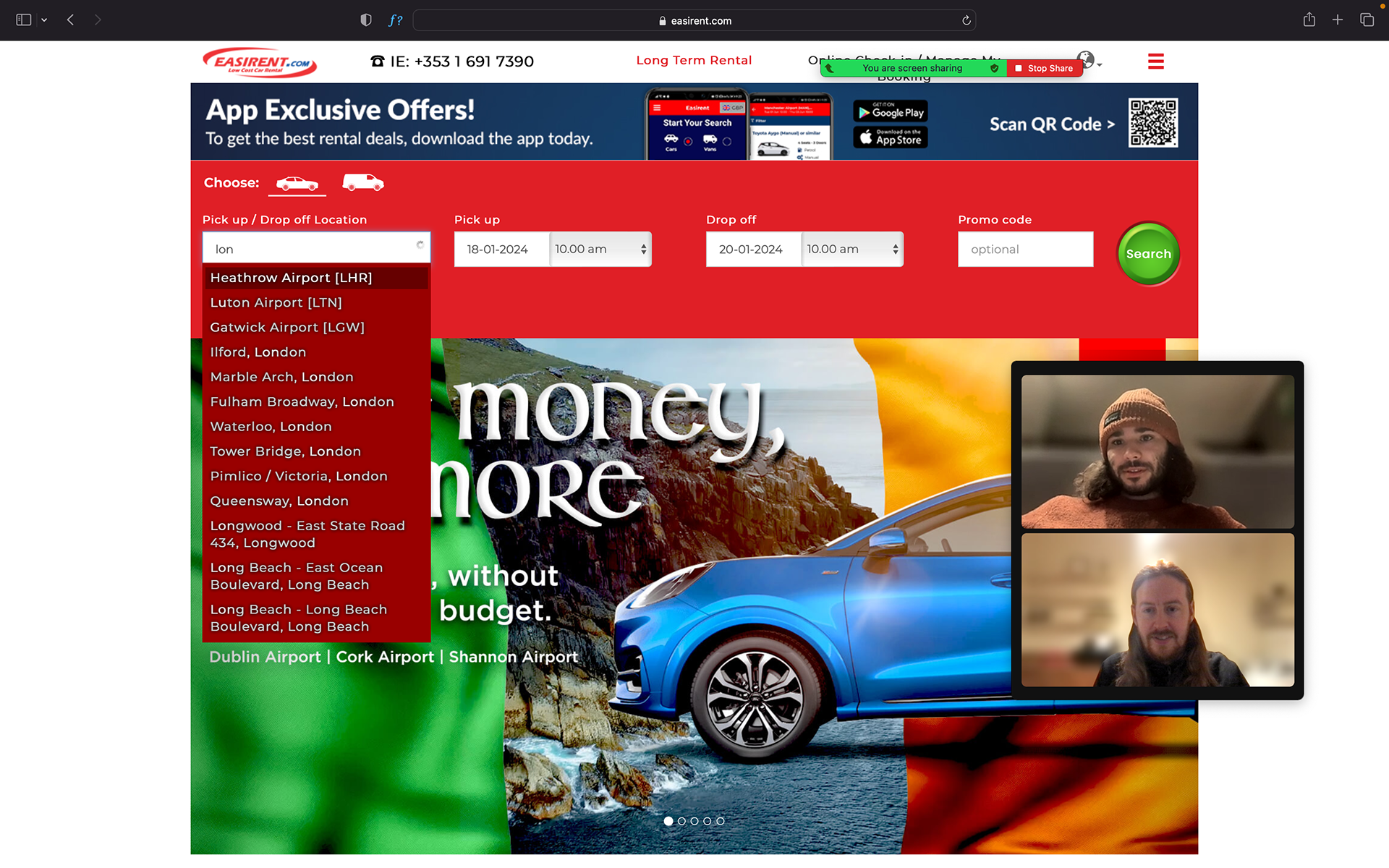
The first step was to carry out user interviews to gain insights on how participants interact with car rental websites. Following the interviews, the participants were also asked to participate in usability testing using existing websites. The testing consisted of two websites and 3 participants were recruited for this, I chose Easirent and Enterprise car rental for the usability tests.
🔍 Key Findings
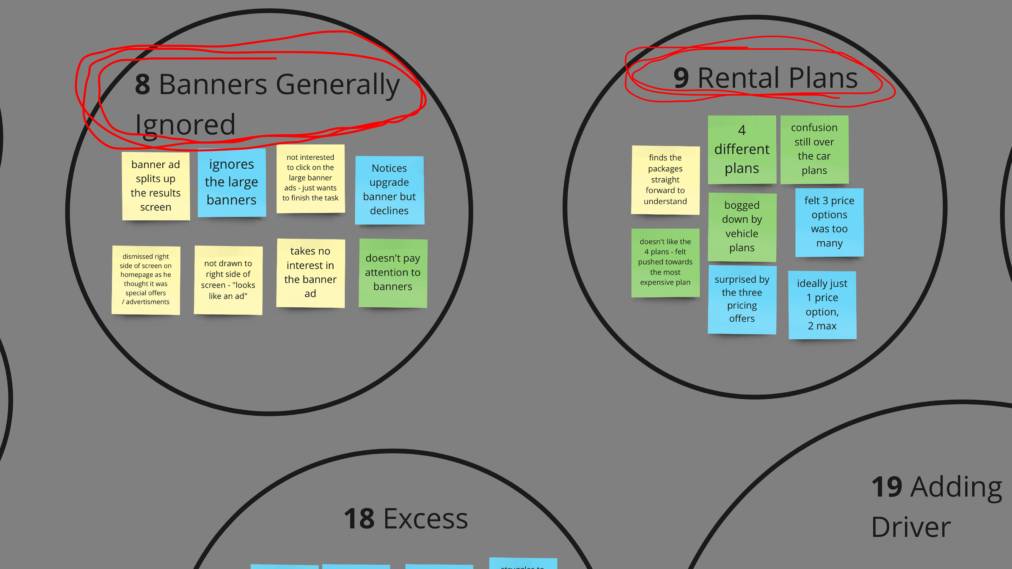
- A lot of information to take in on homepage, large banners are generally ignored.
- Users are instantly drawn to search bar, task focused.
- Likes ease of use, "very intuitive search bar".
- Would like to see more information on collection point (location, times, map etc.).
- In general calendars where easy to use and navigate.
- More clarity around which car users will get, "BMW 1 series auto or similar" what is the similar car?
- Very little was know about loss/damage waiver, and the consequences of this.
- Users felt that there was too many plans to choose from, this ultimately slowed down the booking process and added confusion.
- Deposit required was consider very high, "€1300 security deposit is very high, not maybe have that limit"
- Extra prices not always clear "needed to see a rolling total".
- Cars should be priced per day and per rental.

Affinity Diagram – Analysing
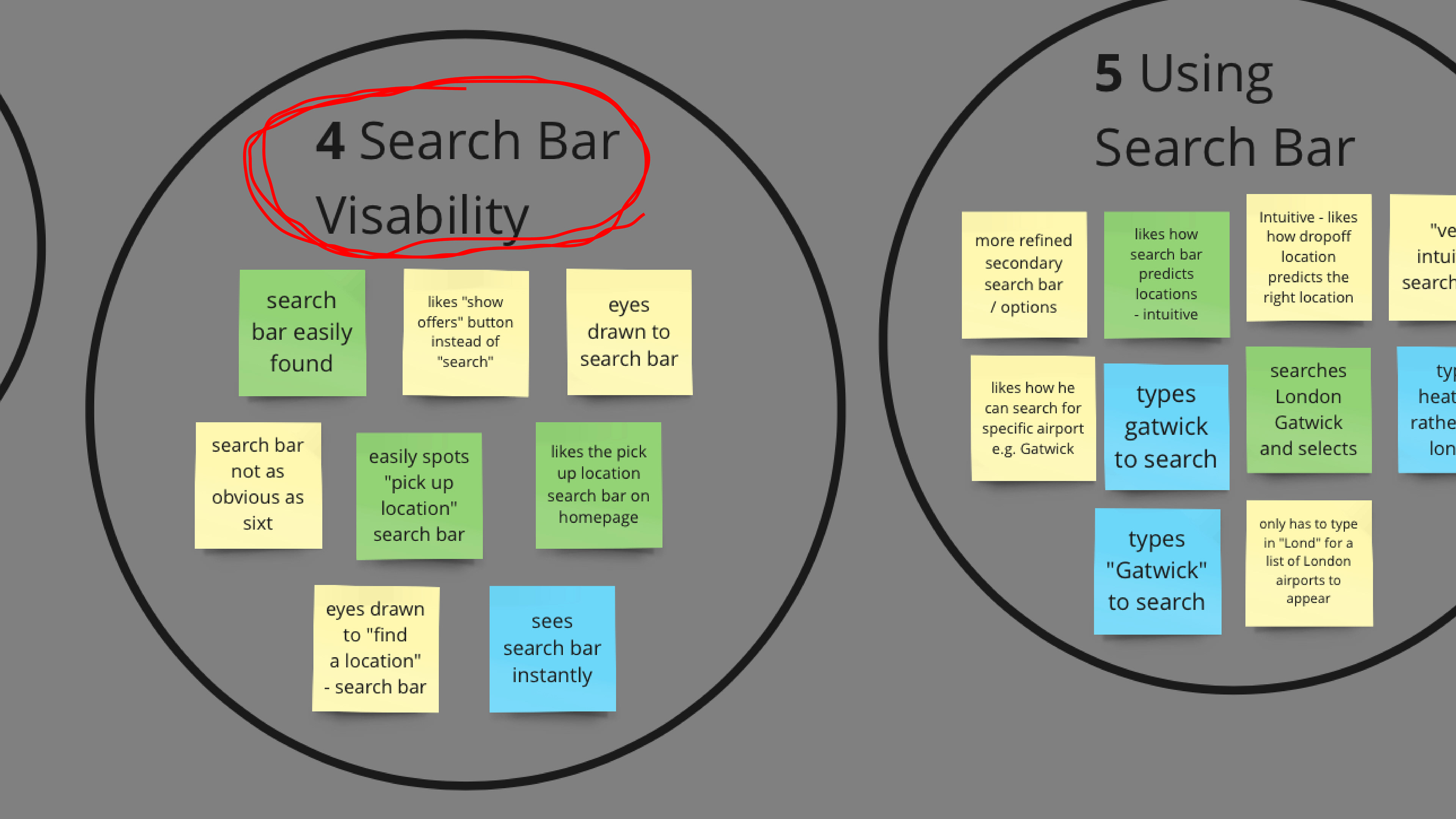
The affinity diagram outcomes saw consistent trends:
- User were task driven.
- In general advertising banners were ignored.
- Too many rental plans which overwhelmed the users.
- Intuitive search bar and tick boxes were preferred.
- Confusion or no knowledge around damage waiver / excess policies.
- Deposits quite signifiant.
- Price focused, low to high.
- A need for transparent pricing.

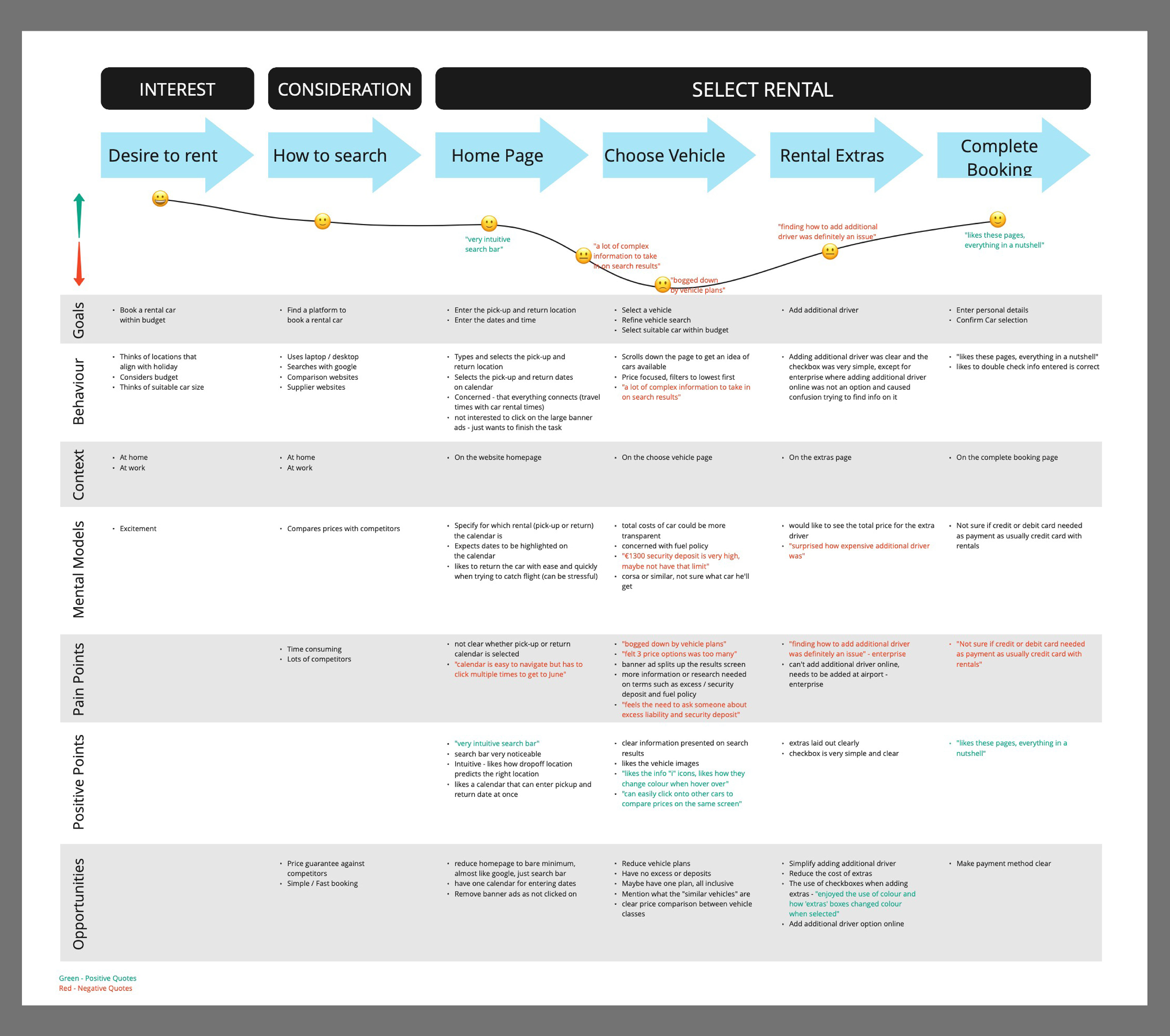
Customer Journey Map – Analysing
I used the insights from the affinity diagram to create the customer journey map, from this a few opportunities arouse to improve the experience:
Screens should only offer options that are relevant to the users as they are task focused. In this instance, the homepage should avoid displaying large banners and focus on the main goals.
The number of vehicle plans should be reduced, consider an all inclusive only plan which removes the need for an excess on rentals.
Simplify adding extras, check boxes was the preferred method.
Make sure costs are transparent and visible throughout the booking process.

Flow Diagram – Design
After defining the goals and deciding on the features to include, I went on to establish the information architecture of the website by creating a User Flow. It helped me visualise the relationship between the content and examine the hierarchy.

Low-Fidelity Wireframes – Design
With the key features and user flow defined , I started to capture my ideas by sketching low-fidelity screens using pen and paper. It enabled me to examine my ideas before moving onto digital wireframes.

Medium-Fidelity Wireframes – Design
After establishing a visual direction for the website layout, I proceeded to enhance the sketches with additional details, transforming them into mid-fidelity wireframes.. In these wireframes, I included elements that directly address users' goals, needs, frustrations while incorporating common design patterns seen in other car rental websites.
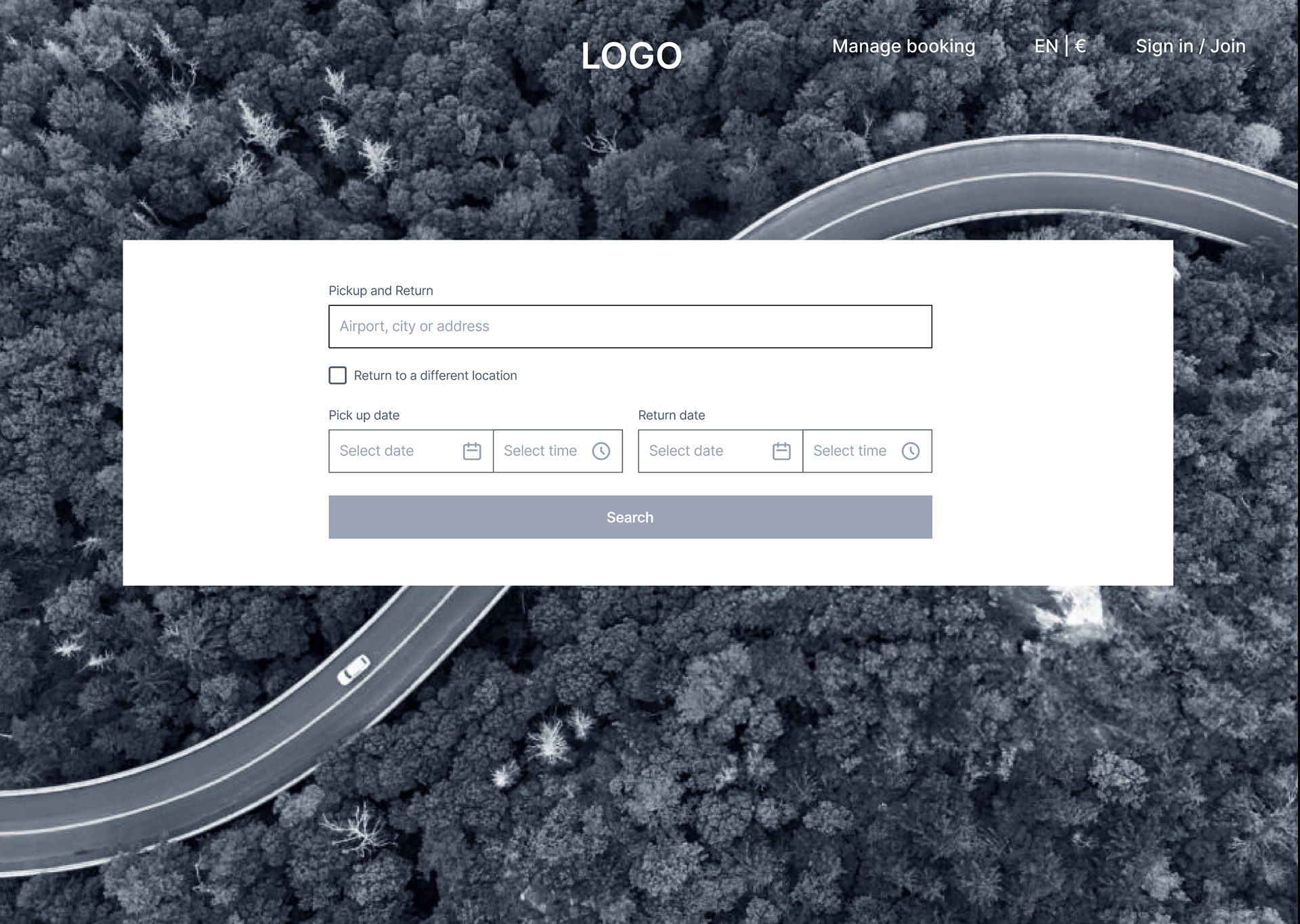
Homepage ➡️
Based on my research findings, I uncovered that users tend to ignore banner advertisements and are task focused With this in mind I removed the banners which enabled users to focus on the task in hand.
The aim was to remove visual disturbances, enabling users too clearly see and be drawn to the search bar, allowing users to reach their goals without obstacles.
Any non-necessary information was kept to an absolute minimum, to keep the screen clutter free
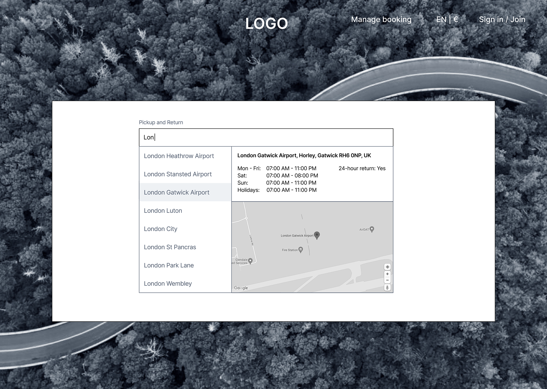
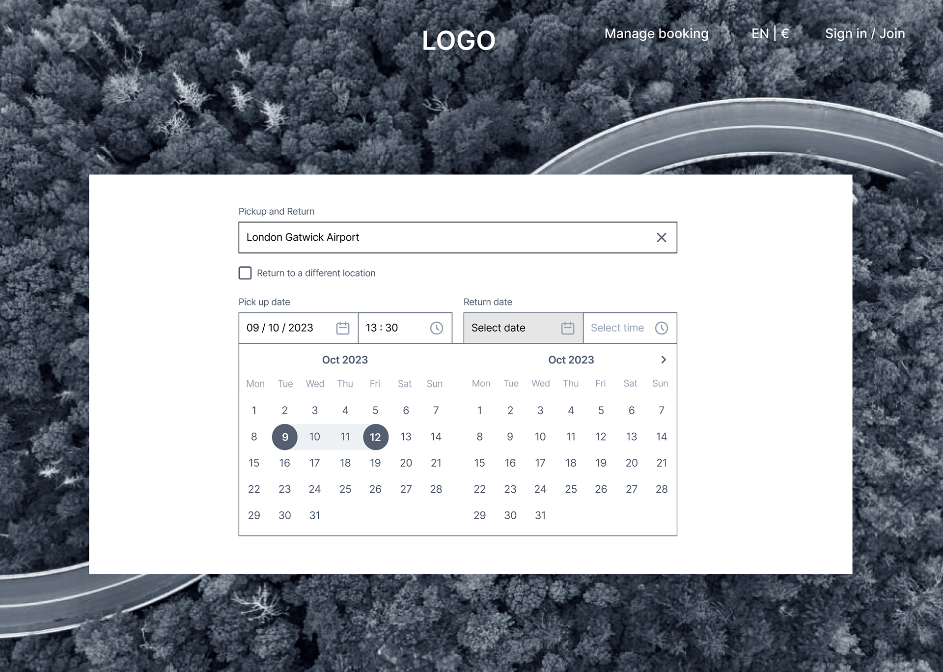
⬅️ Location
Location suggestions automatically appear when the third letter is typed, research showed that users like this suggestion as it aids and speeds up the booking process.
Branch opening times and address are displayed for each location selected. I've also embedded google maps so users can pin point the exact location.
Pickup / Return Date and Time ➡️
Buttons are highlighted as the user interacts with the pick-up / return dates and times, enabling the user to see what they have selected.
Each date / time dropdown is automatically opened once the user has selected the previous input, reducing the amount of "clicks" needed during the process, ultimately creating a smoother, clearer path and faster search process.
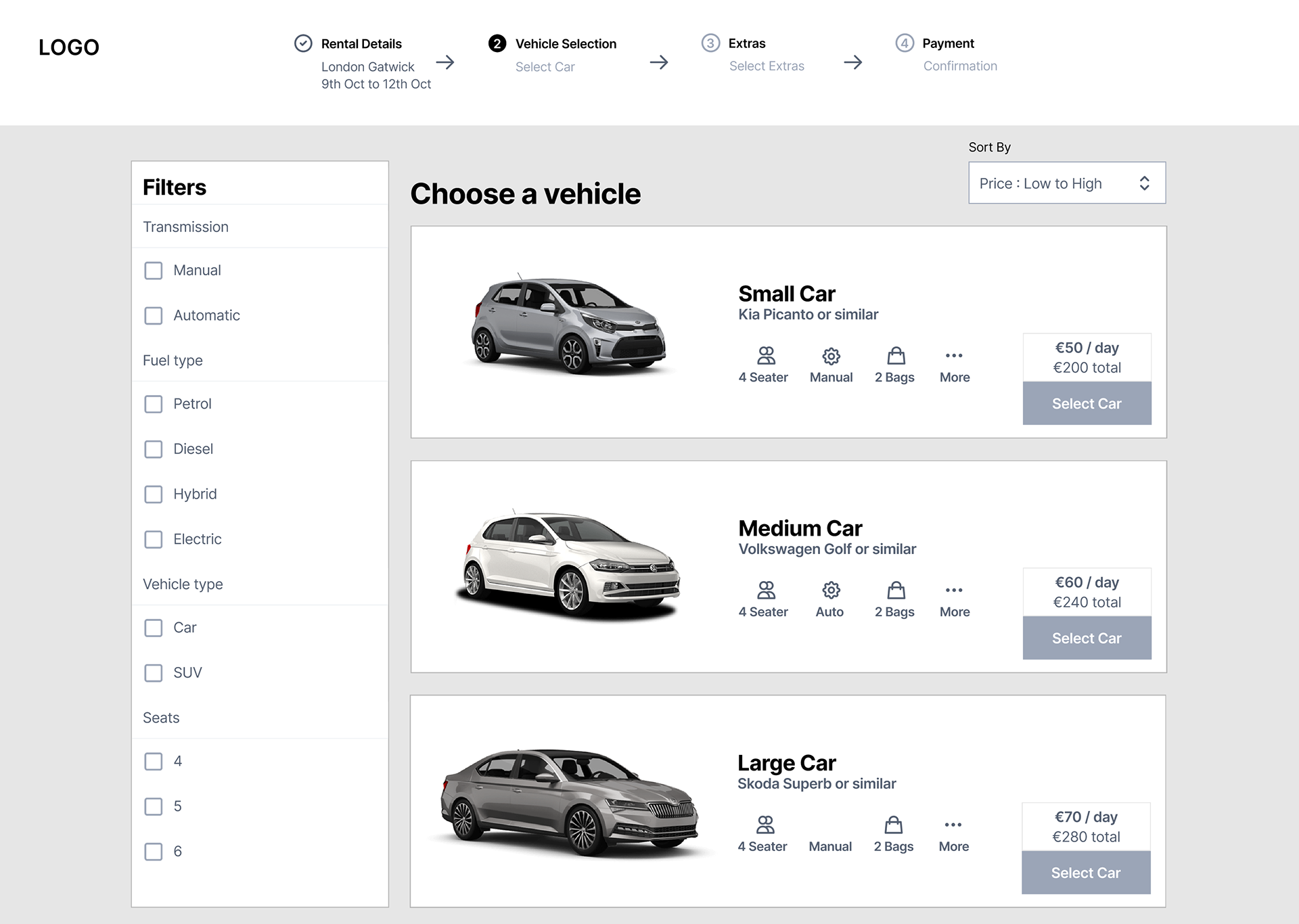
⬅️ Choosing Vehicle
I reduced the plans down to just a one all inclusive fully insured plan, this removes the loss/damage waiver which users failed to understand and the risks involved, while also reducing the cognitive load previously involved with the car plan selection process.
Check boxes are used to filter as these were the preferred option during my research. Cars are sorted by price, low to high automatically as I observed users being price conscious.
Prices are displays per day and per rental, to stop the need for users mentally having to tot up the costs.
Finally I added a stepper to the header, so users know exactly what step in the booking process they are at and can use this to edit previous steps if needed.
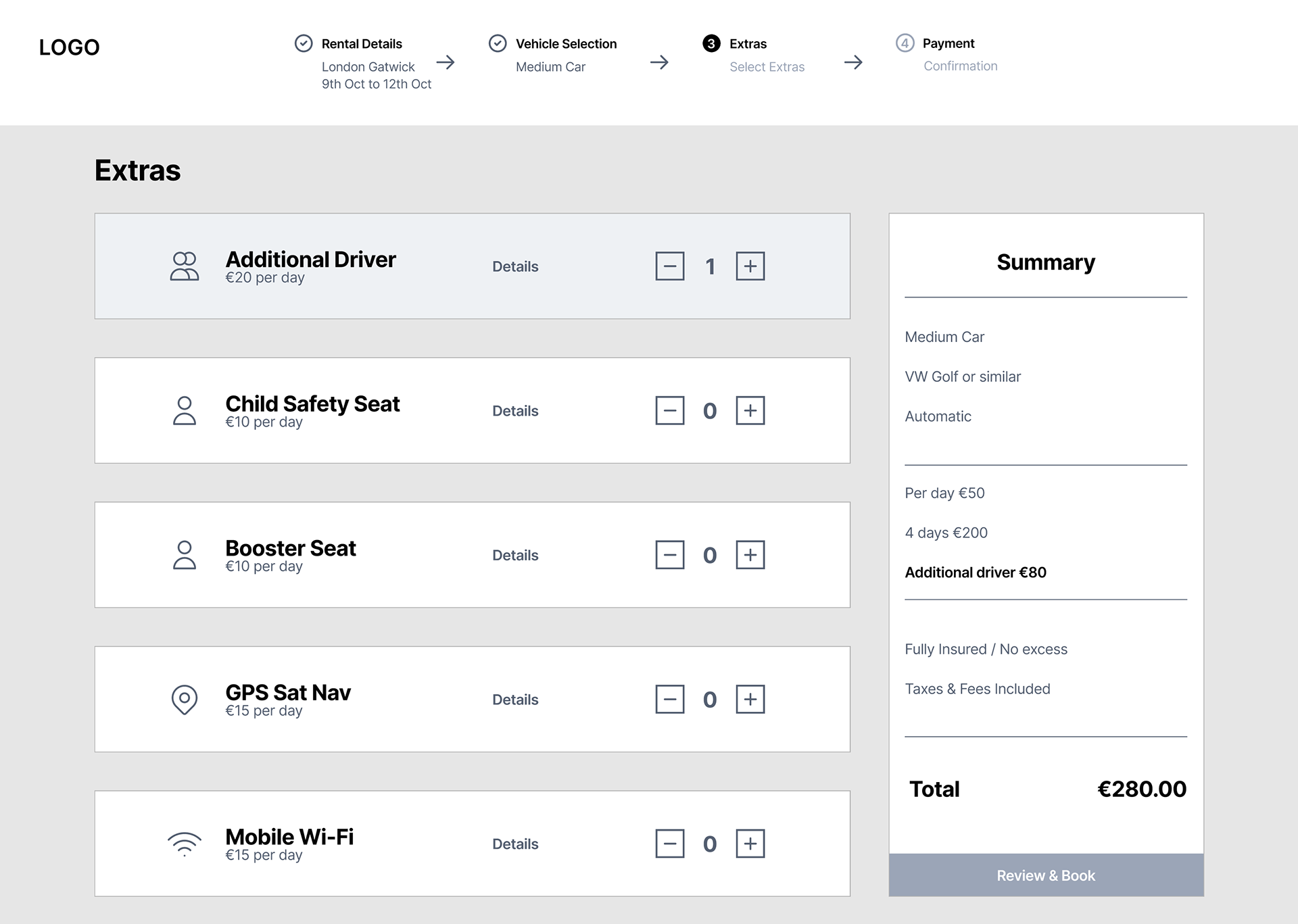
Extras ➡️
Extras are clearly priced and when selected, they are highlighted to show clearly which extras are added.
Once added the price of extras appears in the summary along with the new total.
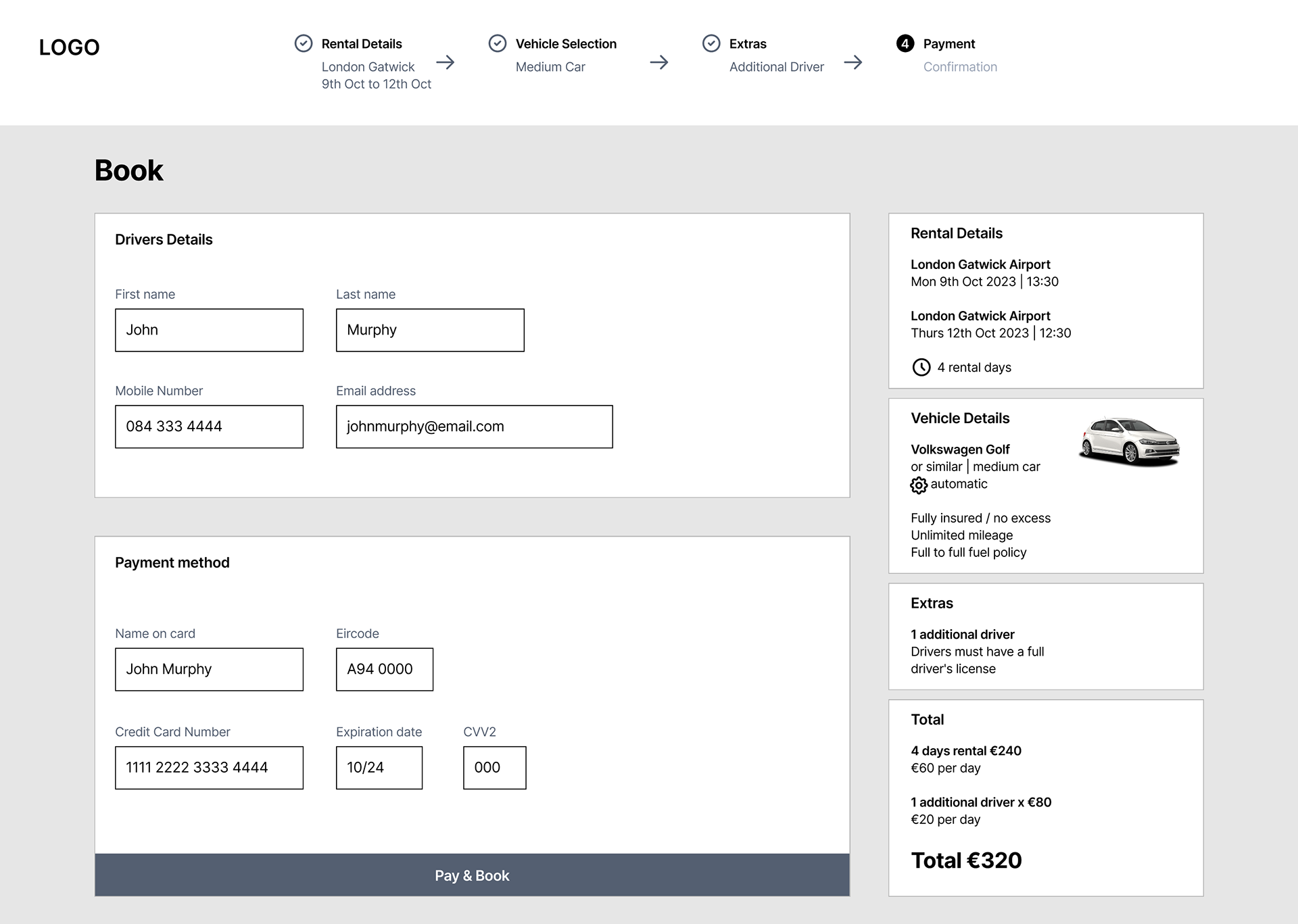
⬅️ Payment
Details required are kept to only necessary.
Rental details are displayed on the right of the screen with pricing very visible, this aids in pricing transparency for the users

Interactive Medium-Fidelity Prototype – Design

What I learned
Convenience is key: Consider adding features in web applications that will speed up the checkout process. Time is precious and users are not going to enjoy excessively searching for important information.
Always value transparency: Gaining a user’s trust early on in the customer journey will keep them around much longer. Clearly stating crucial policies and having clear pricing will create a sense of integrity for the brand/application.
Keep it simple and logical: Folks can quickly feel overwhelmed by cluttered interfaces or wordy descriptions. Rely on basic design principles to create clean and smart layouts, organising information in a way that is intuitive to users.